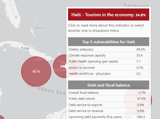
Jubilee USA Network and Latindadd maintain pandemic vulnerability statistics for the Latin American and Caribbean regions. That data lives in Google Sheets, and they wanted to display it on a map as well as in charts and graphs. We wrote a Google Sheets integration and used Leaflet with SVG charts to render the data in a useful and appealing way. Users can view individual country data and data can be filtered by category as well as country, on the map and charts UI simultaneously.

